With GreenSock and ES6 Decorators
Core technologies: ReactJS, ES6, GreenSock Animation Platform
Prerequisites: SASS, ReactJS, NodeJS / Webpack (or another compiler that can handle ES6 decorators)
DOWNLOAD A COMPLETED PROJECT FILE HERE (Just yarn install && yarn start)
Git Repo: https://github.com/zfalen/declarative-react-decorator-transitions
JUMP TO TUTORIAL
INTRODUCTION
As front-end developers, we share a common enthusiasm for building UI that’s not only pleasant to look at, but pleasant to interact with, too. The best kind of applications take seamless interactivity as seriously as they take a stable back-end, and animation is a critical part of the toolkit.
My favorite apps ride the philosophy all the way down to their bones – and are rife with subtle fades, slides and scales that bring a whole extra sense of dimensionality to their user experience.
The advent of component-based UI libraries, like Facebook’s ReactJS, has certainly moved the needle forward in terms of creating self-contained interface elements that are easy to develop, understand and maintain, but I’ve always felt that using the lifecycle hooks these libraries give us to build transitions gets redundant quickly – and there should be a better way to reuse animations across an entire application.
The React community, at large, has attempted to remedy the problem with `react-transition-group`, which essentially gives us a `<TransitionGroup/>` component we can use to wrap elements within our JSX and apply CSS animations.
However, although this approach is a decent way to bind an animation to specific parts of a larger component, I always find working can clutter my code and obscure the real purpose behind my pretty React elements. Furthermore, although you can use CSS classes to perform relatively complex animation sequences, it’s not particularly fun to do so. (If you want to talk about obscuring intentions, look no further than a string of CSS keyframes!)
DECLARATIVE ANIMATIONS WITH GREENSOCK
Throughout my adventures with web animation, I’ve found a far better friend in GreenSock Animation Platform – a brilliant little JS library that lets us animate just about anything we like with a simple, declarative syntax and a suite of functions for creating singular tweens as well as complex timelines. 
GREENSOCK INTRO TUTORIAL
GREENSOCK DOCUMENTATION
You can use GreenSock directly in the browser by importing from a number of different CDNs, but my new favorite way to use it is as part of a React workflow; and, with just a little sleight of hand, you can wrap the whole process into a simple, re-useable little pattern.
DECLARATIVE ANIMATIONS WITH GREENSOCK AND ES6 DECORATORS
In this tutorial, you’ll learn a better method for building component in-and-out transitions in React, and it’s as simple as this:
Slick, right? With a pattern this simple, you’ll only need to tag each component you want to transition in-and-out in a specific way with a single, declarative decorator, and then use it the same way you would anywhere else in React. This means you can ditch the `<TransitionGroup/>` declarations, keep your code a whole lot more DRY.
So, without further ado, let’s get started!
In order to make all of this work the right way, you’ll need a basic server that renders your React component tree to HTML, and uses a compiler that can handle some advanced, early-release ES6 features, like decorators. I prefer to use Webpack, and will gladly show you how to set your config up to do this – just shoot me a message.
For the sake of ease, we’ll be using a miniature stack that uses `create-react-app` and `custom-react-scripts` to give us a little demo playground without the overhead of any server-side code.
To get started, install both libraries via NPM by running the following in your terminal:
npm i –g create-react-app custom-react-scripts
Then, we’ll need to create a new folder for the app and navigate into it. Once you’re there, run the following command to spin up a brand new React application:
create-react-app my-app –scripts-version custom-react-scripts
This will set up everything for you, and create a Node server in the background with a Webpack compiler so that we can tinker with the front-end without having to write our own stack. However, `create-react-app` doesn’t ship with certain advanced features out-of-the box, so we’ll need to add them in manually. (This is why we’ve included `custom-react-scripts` – take a look at this Medium article if you want to learn more.)
For this tutorial, we’ll want to use both the Babel `stage-0` and `transform-decorators` plugins, and we can enable these by making sure the following config exists in the `.env` file in the root directory of our new app:
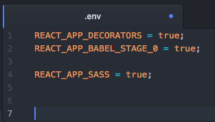
By default, the setup process we ran earlier should enable these settings, along with a number of others. We can safely delete all of these settings, except the three listed above. We’ll also remove the following files from the `/src` directory within our app:
- App.css
- App.less
- App.styl
- App.test.js
- Emoji.js
- First.module.css
- Fourth.module.styl
- Index.css
- Logo.svg
- Second.module.scss
- Third.module.less
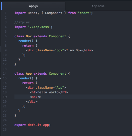
Then, we need to remove all the references to these files in our `app.js` and `index.js` files. We’ll also ditch just about all of the JSX inside our <App/> component, so that, at the end, your `app.js` file looks as follows:

Your `index.js` file should look like this:

Now, we’re ready to go! Navigate into the root level of your project folder and run the following script to spin up the app and open it in your browser window (at localhost:3000):
yarn start
Nice! You have an app that looks like this:

Let’s make it better and do some animation. First, we’ll make a super simple little box component, and control it with a button. Put the following into your `app.js` file:
We’ll also style it up with some basic SASS (in your `App.scss` file):


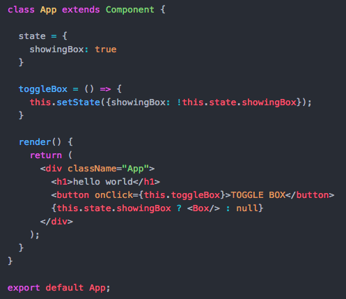
To control whether or not the box is showing, we’ll use a button on the <App/> component:

Great! It turns on and off. But how can we animate it every time the component mounts and unmounts? Let’s install GreenSock and take a look:
yarn add gsap
Import the library to `App.js,’ and add the following to a new `componentDidMount()` method on the <Box/> component:

TweenMax is GSAP’s core library, and all of its functions expect a few basic inputs:
- A DOM element selector, much like in jQuery
- A duration for the animation, in seconds
- The animation parameters, as an object
Essentially, our animation reads like this:
“When the Box component mounts, animate all DOM elements with the `.box’ class from complete transparency and 50 pixels down, to whatever their default values are as declared in CSS. And, do it all over .5 seconds.“
(TweenMax has a bunch of other animation commands, and a few gotchas. It’s a big, powerful library with few limitations – and I’ll let you decode them yourself through the official GSAP docs)
Try toggling the button back and forth again – now the box fades upward when it mounts to the DOM! Plus, the TweenMax syntax makes the animation clean and declarative.
But what about animating the box out? That’s a little harder to do the way we’ve set things up, and we need to get a little creative to achieve what we’re looking for. React doesn’t ship natively with the ability to delay or stop a component from unmounting once its parent tells it to go away, even in `componentWillUnmount()`, so we need to control the logic from the parent component itself.
To do this, we can leverage GSAP’s callback functionality, and toggle our `showingBox` state from earlier after we complete a transition out animation. To do that, let’s add the following to the `toggleBox()` method we added to the <App/> component earlier:

This does the same thing as before, except now the GSAP animation will animate the Box component to 0 transparency and 50 pixels down, then tell the parent to toggle its state and unmount it from the DOM. Try it out; the transition should now work as expected.
For reference, your entire `App.js` should now look like this:

Although this kind of pattern works just fine for most applications, it’s not the easiest to read – and it can be very easy to lose track of which transitions target which components, particularly when child components are refactored into their own separate files. This is pretty nearly the only way to do transition animations declaratively in vanilla React – but, fortunately, we’ve got a few options to make things a little more manageable.
INTRO TO REACT-TRANSITION-GROUP
One of my favorites is with the `react-transition-group` library. The library provides a number of options for structuring transitions, including those based on CSS keyframes. To keep our animations declarative, however, we’ll be using the library’s <Transition/> component.
To do it, we first need to install the package with:
yarn add react-transition-group
Then, we need to require the <Transition/> component specifically by adding the following line to the top of our `App.js’ file:

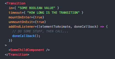
Essentially, this component gives us a new lifecycle hook, called `addEndListener()`, which fires before and after the child components it wraps mount or unmount from the DOM. Furthermore, the hook gives us access to a `doneCallback()`, which we can use to manually trigger the next step of the React lifecycle.
Basic setup is as follows, where the `elementToAnimate` is the child component and passed automatically:
Using this component, we can refactor our <Box/> component like so (NOTE: We have to convert our duration to milliseconds for the <Transition/> component):

We can also get rid of our GSAP callback pattern on `toggleBox()` in our <App/> component, and get rid of the ternary function that turns the <Box/> off if the `showingBox` state is `false`. The <Transition/> component will handle the same logic internally, using its `in` prop. The new <App/> component will look like this:

Sweet! Now, the <Box/> component can be reused wherever we want throughout the app, so long as we pass it a Boolean `showingBox` prop that triggers it to animate in and out.
MOVING TO HIGHER ORDER COMPONENTS
I can hear you saying: “That’s great and all, but it just bloated my <Box/> component, and I’m not sure it’s any clearer than the first pattern you showed me.” And, you’d be right – if we couldn’t refactor it any further.
Lucky for us, the <Transition/> component fits the bill perfectly for reuse as a higher-order component, which is, essentially, a function we can pass any React component to and return that same component wrapped-up inside a <Transition/>. For more on higher-order components, see this link.
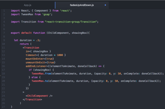
To make it happen, let’s create a new file within our `/src` folder, and call it ‘fadesUpAndDown.js`. Inside of the file, add the following:
Then, inside of `App.js`, import our new function, pare down the contents of the <Box/> component to their original form, and replace where we call it as a child of the <App/> component with the following:
Test it out, and everything works great! Now, this is pretty slick – but there’s one fairly obvious problem. Because our higher-order component is really just a function that wraps the <Transition/> around whatever we pass it (in addition to a Boolean value), we can only pass it the component class itself. We can’t pass the function a traditional, React / JSX component declaration, wrapped in < … /> tags – doing so will throw a bunch of React type errors.

This should be a pretty clear issue, because it suddenly becomes really difficult to pass down props to our child components. In fact, we can only do it by passing them as arguments into the higher-order function, and then forwarding them onto the child component there – kind of like we do with the `showingBox` value. But that’s not really an ideal solution is it?
LEVERAGING ES6 DECORATORS
Fortunately, ES6 proposes a new feature that can make our life so much cleaner: Decorators. Technically, decorators are a TC39 proposal, and they don’t ship natively with today’s ES6 spec; but they’re making a lot of headway, and we can play with them in our code by enabling the right Babel compiler (we did this during setup!). For more, look here.
Essentially, decorators let us wrap and modify JavaScript classes and object literals at design time – sound familiar? They let us presuppose that any <Component /> declarations will be wrapped in whatever the function returns, any time that we call that component. And, it lets us do it in a clean little syntax. Au revoir, higher-order function calls!

But, we still have the issue of passing props – and, in our case, we need to pass the `showingBox` prop in order to trigger our transition animation. But, here’s the beautiful thing about decorators: because the <Box /> component now presupposes that it will be passed through our higher-order function, we can call it as we normally would, and pass props as we would normally.

But wait! There’s one more thing we need to do to make the pattern work: because we’re passing the `showingBox` value as a prop again, we need to make sure our higher-order function is returning a React component, so that prop inheritance works as we’d expect it to. So, rather than just returning our <ChildComponent /> wrapped in a <Transition />, let’s return a new component, which will inherit our props and pass them to its children.

Rock on. We now have a declarative pattern that makes it easy to tag any child component with our `@FadesUpAndDown` transition, so long as we pass it a Boolean value for the `showingBox` prop. But what if we want to build more transitions that use different animations? The skeleton in `fadesUpAndDown.js` is fairly easy to reproduce, but it also kind of buries our actual animation declarations deep in the tree, and obscures their true purpose. Plus, manually wrapping everything in a new <Transition /> tag every time we need a new transition feels redundant.
MAKING THINGS MODULAR
To make things more modular, let’s abstract our <Transition /> wrapper into a file we can import elsewhere, and just pass it the following:
- The child component it should wrap
- A Boolean value to control animation
- An in and an out transition from GSAP
To do so, lets copy all the contents of our `fadesUpAndDown.js` to a new file, and call it `transitionWrapper.js`. We can ditch the requirement for `TweenMax` up top, and pass in the `timeout` prop using an argument called `animationDuration`. Then, rename the prop we previously called `showingBox` to `animationTrigger` to promote clarity, since we presumably want to transition more than just boxes.
Instead of calling GSAP animations directly as before we’ll pass them in as arguments called `inTransition` and `outTransition` – and we’ll need to pass each one our references to both `elementToAnimate` and the `doneCallback`. We’ll also pass through any additional props we’d ever want to give our <ChildComponent/> using the ES6 spread syntax.
When you’re done, `transitionWrapper.js` should look like this:

Moving back to `fadesUpAndDown.js`, we can strip almost everything out – and import our new `TransitionWrapper` function instead. Now, all we have to do is declare an `animationDuration`, as well as `inTransition` and `outTransition` – both of which should be functions that accept `elementToAnimate` and `doneCallback` as arguments and pass them directly to our TweenMax calls.
Then, we just pass the three variables, plus our ChildComponent, into the `TransitionWrapper` function and return it. When you’re done, it will look like this:
That’s it! Now, you can tag your `@FadesUpAndDown` decorator onto any React component, so long as you pass it a Boolean `animationTrigger` prop to control whether or not it should render in or out.
And, you can create brand new transitions clean and simple – just copy the skeleton we made in `fadesUpAndDown.js`, and swap out your `TweenMax` calls with whatever declarative animations you’d like.
For instance, we could make a `@BounceInAndOut` transition easily by doing the following:

You can see the outcome by repeating our original process with a new <Box2/> component, controlled by a separate button, and tag it with your new decorator:

Now, go out and bring better declarative animation code into the world.
Rock on.


 iommedia420.wordpress.com